Radio Buttons Fields
Radio buttons fields give you a group of radio (opens new window) inputs, and allow the author to select a single value (or provide a custom one, when allowed).
#Settings
In addition to the standard field options, radio buttons fields have the following settings:
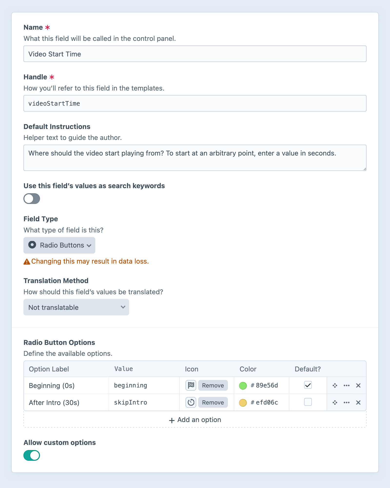
- Radio Button Options — Define any number of options to populate the menu.
- Label — A text description of the option, displayed to the author.
- Value — The value stored when a given option is selected.
- Icon (Optional) — Choose from the standard system icon palette.
- Color (Optional) — A color for the icon, or, when no icon is selected, a color pip.
- Default? — One option can be marked as the default.
- Allow custom options — Whether authors can define an “other” option, on-the-fly.
#Development
#Working with Radio Buttons Field Data
If you have an element with a radio buttons field in a template, you can access its data using the field’s handle:
{% set value = entry.myRadioFieldHandle %}
$value = $entry->myRadioFieldHandle;
That will give you a craft\fields\data\SingleOptionFieldData (opens new window) object that contains information about the selected value and available options.
Outputting the object casts it to a string, which is equivalent to directly accessing its value (opens new window) property:
{{ entry.myRadioFieldHandle }} or {{ entry.myRadioFieldHandle.value }}
$entry->myRadioFieldHandle; // -> craft\fields\data\SingleOptionFieldData
$entry->myRadioFieldHandle->value; // -> string
To check if any option is selected, you must test the value (opens new window) property, explicitly:
{% if entry.myRadioFieldHandle.value %}
  {# Yep, a value was selected! #}
{% endif %}
if ($entry->myRadioFieldHandle->value) {
  // Yep, a value was selected!
}
To show the selected option’s label, use the label (opens new window) property:
{{ entry.myRadioFieldHandle.label }}
{# "The selected option’s user-facing label!" #}
$entry->myRadioFieldHandle->label; // -> "The selected option’s user-facing label!"
If the author provided a custom value, no label will be available.
To loop through all the available options, iterate over the options (opens new window) property. The selected option’s selected property will be true.
{% for option in entry.myRadioFieldHandle.options %}
  Label: {{ option.label }}
  Value: <code>{{ option.value }}</code>
  Selected: {{ option.selected ? 'Yes' : 'No' }}
{% endfor %}
foreach ($entry->myRadioFieldHandle->options as $option) {
    $option->label;
    $option->value;
    $option->selected ? 'Yes' : 'No';
}
If the author provides a “custom” value, no option will be marked as selected.
#Querying Elements with Radio Buttons Fields
When querying for elements that have a radio buttons field, you can filter the results using a query param named after your field’s handle. Possible values include:
| Value | Fetches elements… |
|---|---|
'foo' | with the foo option selected (or a custom value of foo). |
'not foo' | without the foo option selected (or a custom value of foo). |
['foo', 'bar'] | with either the foo or bar options selected (or a custom value of foo). |
['not', 'foo', 'bar'] | without either the foo or bar options selected (or a custom value of foo). |
{# Fetch entries with the 'foo' option selected #}
{% set entries = craft.entries()
  .myRadioFieldHandle('foo')
  .all() %}
// Fetch entries with the 'foo' option selected
$entries = \craft\elements\Entry::find()
    ->myRadioFieldHandle('foo')
    ->all();
#Saving Radio Buttons Fields
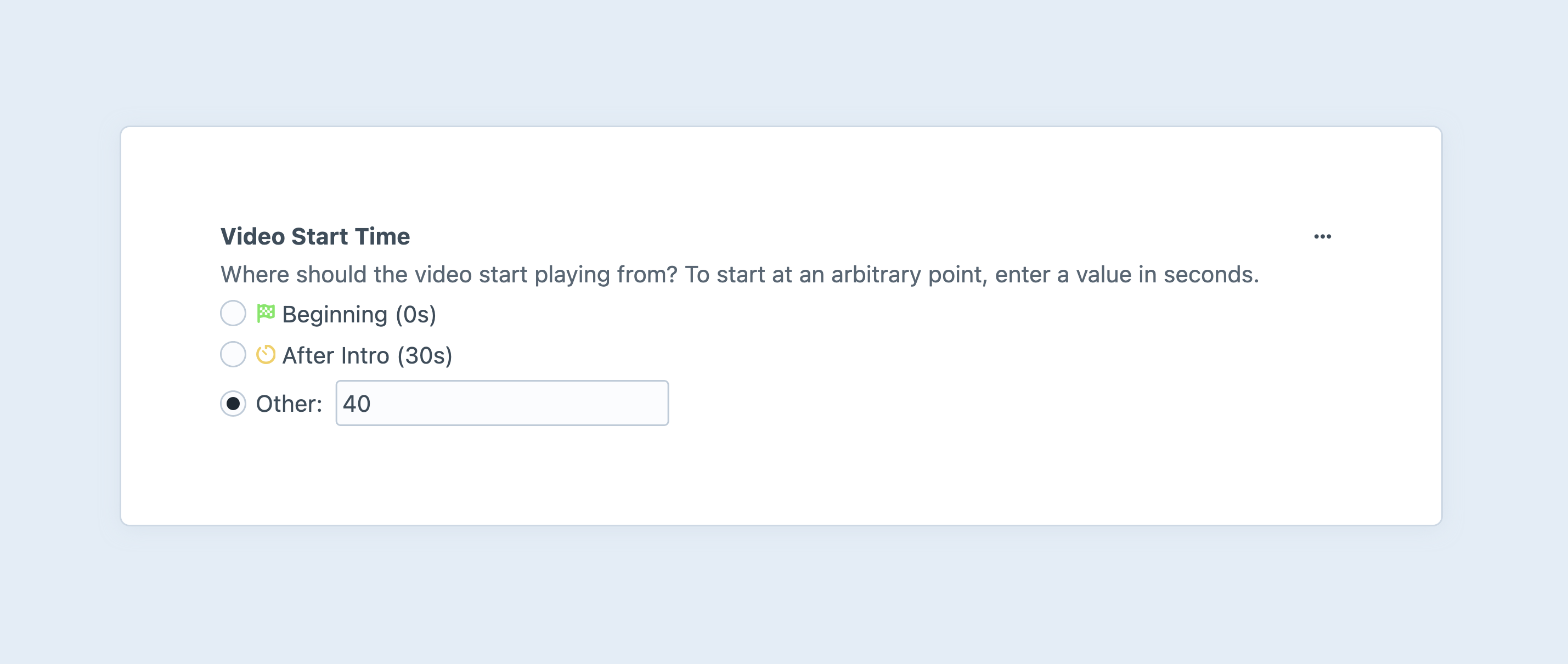
If you have a front-end element form (such as an entry form (opens new window)) that incorporates radio button field data, you can use this fragment as a starting point:
{# Fetch the global field definition: #}
{% set field = craft.app.fields.getFieldByHandle('myRadioFieldHandle') %}
{% set currentValue = entry.myRadioFieldHandle.value ?? null %}
{% set hasCustomValue = currentValue and currentValue not in (field.options|map(o => o.value)) %}

<ul>
  {# Iterate over the defined options: #}
  {% for option in field.options %}
    {% set selected = currentValue == option.value or not currentValue and option.default %}

    <li>
      <label>
        {{ input('radio', 'fields[myRadioFieldHandle]', option.value, {
          checked: selected,
        }) }}
        {{ option.label }}
      </label>
    </li>
  {% endfor %}

  {# Optional — Provide a text input for a custom value: #}
  <li>
    <label>
      {{ input('radio', 'fields[myRadioFieldHandle]', '', {
        id: 'myRadioFieldHandleOther',
        checked: hasCustomValue,
      }) }}
      Other:
      {{ input('text', 'fields[myRadioFieldHandle]', hasCustomValue ? currentValue : null, {
        disabled: not hasCustomValue,
        id: 'myRadioFieldHandleCustom',
      }) }}
    </label>
  </li>
</ul>
Unfortunately, browsers will always send the last input value among those with the same name. This means we need to selectively disable the text input:
<script>
  // Connect to the form element with an ID:
  const $form = document.getElementById('form');

  //
  const $other = document.getElementById('myRadioFieldHandleOther');
  const $custom = document.getElementById('myRadioFieldHandleCustom');

  $form.addEventListener('change', function(e) {
    $custom.disabled = !$other.checked;
  });
</script>
The first snippet handles initializing the pair of inputs in the correct state; JavaScript takes over and watches for changes to the form, and synchronizes them in the client.