Styling
Craft has no opinions about how you style your front-end. This section covers some basic, broadly-applicable, framework-agnostic solutions for integrating CSS into your project. You’ll find champions of virtually every popular paradigm in our community (opens new window)—from vanilla CSS to Tailwind to CSS-in-JS!
#Adding a Style Sheet
When we first created _layout.twig, it included this line:
{% do craft.app.view.registerCssFile('@web/styles.css') %}
This is equivalent to using a plain <link> tag, but it takes care of generating a valid, absolute URL and building the appropriate HTML. You could construct it yourself, like this:
<link href="{{ url('styles.css') }}" rel="stylesheet">
The same tag can be used anywhere in Twig, meaning each template (say, for the individual post pages) can request that a style sheet be added to the final document’s <head>:
{# Say, from `templates/blog/_entry.twig`! #}
{% do craft.app.view.registerCssFile('@web/post.css') %}
Of course, this doesn’t do any good if there’s no underlying CSS file!
#Project CSS
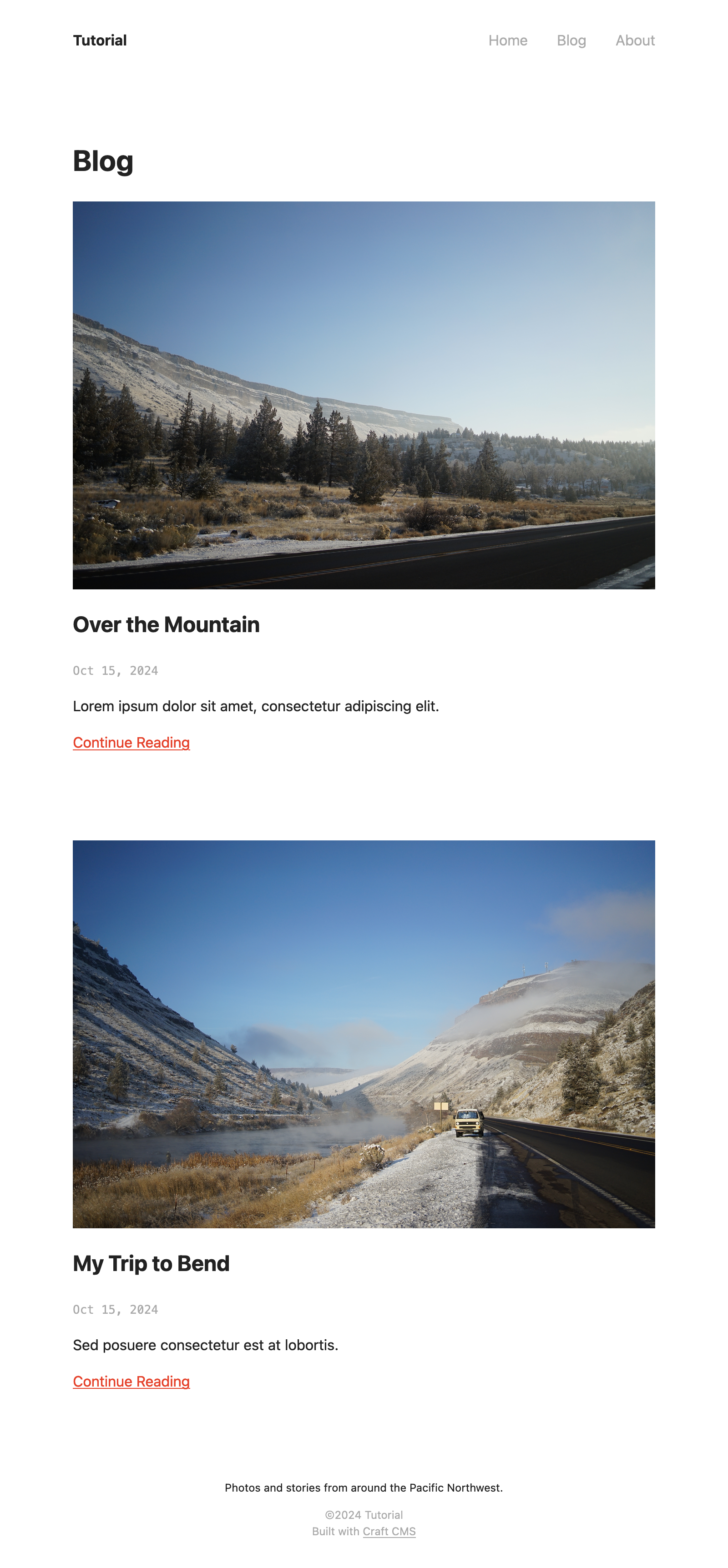
Let’s get some baseline styles into the project so we can visualize the structure of our HTML a bit better.
Grab the contents of this file (opens new window) from the tutorial project repository on GitHub and paste it into the web/styles.css file we created at the beginning of the tutorial.
The blog index should now look something like this:
#Making Styles Dynamic
#Navigation
The example style sheet above includes a couple of rules that help make the global navigation more useful:
nav a {
    color: var(--color-muted);
}

nav a.active,
nav a:hover {
    color: var(--color-base);
}
The first rule sets a default color (var(--color-muted)) for links in the nav element. The second one combines a :hover “pseudo-selector” and an .active class selector that applies a darker color (var(--color-base)) under certain conditions. Our HTML doesn’t add this class, though! Let’s see what it takes to wire this up, in _layout.twig:
{# Get the first segment of the current URI: #}
{% set navSegment = craft.app.request.getSegment(1) %}

<nav>
  <ul>
    <li>
      <a href="{{ url('/') }}" class="{{ navSegment is empty ? 'active' : 'inactive' }}">Home</a>
    </li>
    <li>
      <a href="{{ url('blog') }}" class="{{ navSegment == 'blog' ? 'active' : 'inactive' }}">Blog</a>
    </li>
    <li>
      <a href="{{ url('about') }}" class="{{ navSegment == 'about' ? 'active' : 'inactive' }}">About</a>
    </li>
  </ul>
</nav>
The first highlighted line is a call to one of Craft’s internal functions that looks at the current URI or path. If we were on the /blog/topics/road-trips or /blog pages, for instance, the first “segment” would just be blog. If we were on /about, the first segment would be about.
The remainder of the highlighted lines add a new class attribute to each anchor tag, and output either active or inactive, using Twig’s ternary operator (?). You can think of this as a combination of an output tag ({{ ... }}) and a control tag ({% ... %}): the condition is a comparison against the navSegment variable, where a “truthy” result returns the value after the ?, and a “falsey” result returns the value after the :. Ignoring for a moment that we aren’t displaying the navigation on the homepage, its comparison doesn’t have a value to test against, so we just check if the first segment is “empty!”
Refresh your browser, and see the link automatically highlighted:
#Matrix Blocks
One thing that our HTML does currently support is different treatment for each entry type in our Post Content field.
Recall that we had a series of if tags that separated output based on each block’s type:
{# Text blocks: #}
<div class="content-block text">{# ... #}</div>

{# Image blocks: #}
<div class="content-block image">{# ... #}</div>

{# Unsupported blocks: #}
<div class="content-block unsupported">{# ... #}</div>

{# Quote blocks (if you implemented them): #}
<div class="content-block quote">{# ... #}</div>
Rules that affect only one block type might look like this:
.content-block.image {
    background-color: #EEE;
    padding: var(--layout-site-gutter);
    transform: rotate(-1deg);
}

.content-block.unsupported {
    border: 1px dashed var(--color-highlight);
    color: var(--color-highlight);
    padding: var(--layout-site-gutter);
    text-align: center;
}
These aren’t included in the style sheet, but they can be added just after the other post-specific styles.
#Advanced Styles and Customization
You are in complete control of the HTML that Craft outputs, so there are very few limitations with respect to its structure and substance!
#Variation
In addition to setting flags based on your content, you have access to a bevy of tools and state:
- Introduce variation with randomization, with the
random()andshuffle()functions; - Step through values with the
cycle()function, inside a loop; - Use
nowand date comparisons to output different content based on the time of day; - Let administrators select values in a global set (or on particular entry, category, asset, etc.) to customize the site or page’s appearance;
#Interpolating CSS
While Twig’s primary target is HTML, you are welcome to output variables into a <style> tag within it:
<head>
  {# ... #}

  <style>
    body {
      background-color: {{ theme.backgroundColor | e('css') }};
      color: {{ theme.textColor | e('css') }};
    }
  </style>
</head>
This presumes theme is the handle of a global set that contains two Color fields named Background Color and Text Color. Craft doesn’t have any inherent understanding of “themes” like other platforms, but you can create all kinds of aesthetic and functional settings that are suited to your project!