Image Transforms
Instead of requiring content editors to upload images at a specific sizes, Craft lets you define “image transforms” for automatically manipulating images in predefined ways, or on-demand. Transforms are non-destructive, meaning they have no effect on the original uploaded image.
Transforms can be defined in the control panel or directly from your templates and GraphQL queries.
#Named Transforms
Named transforms are created from the control panel by navigating to Settings → Assets → Image Transforms and press New Transform.
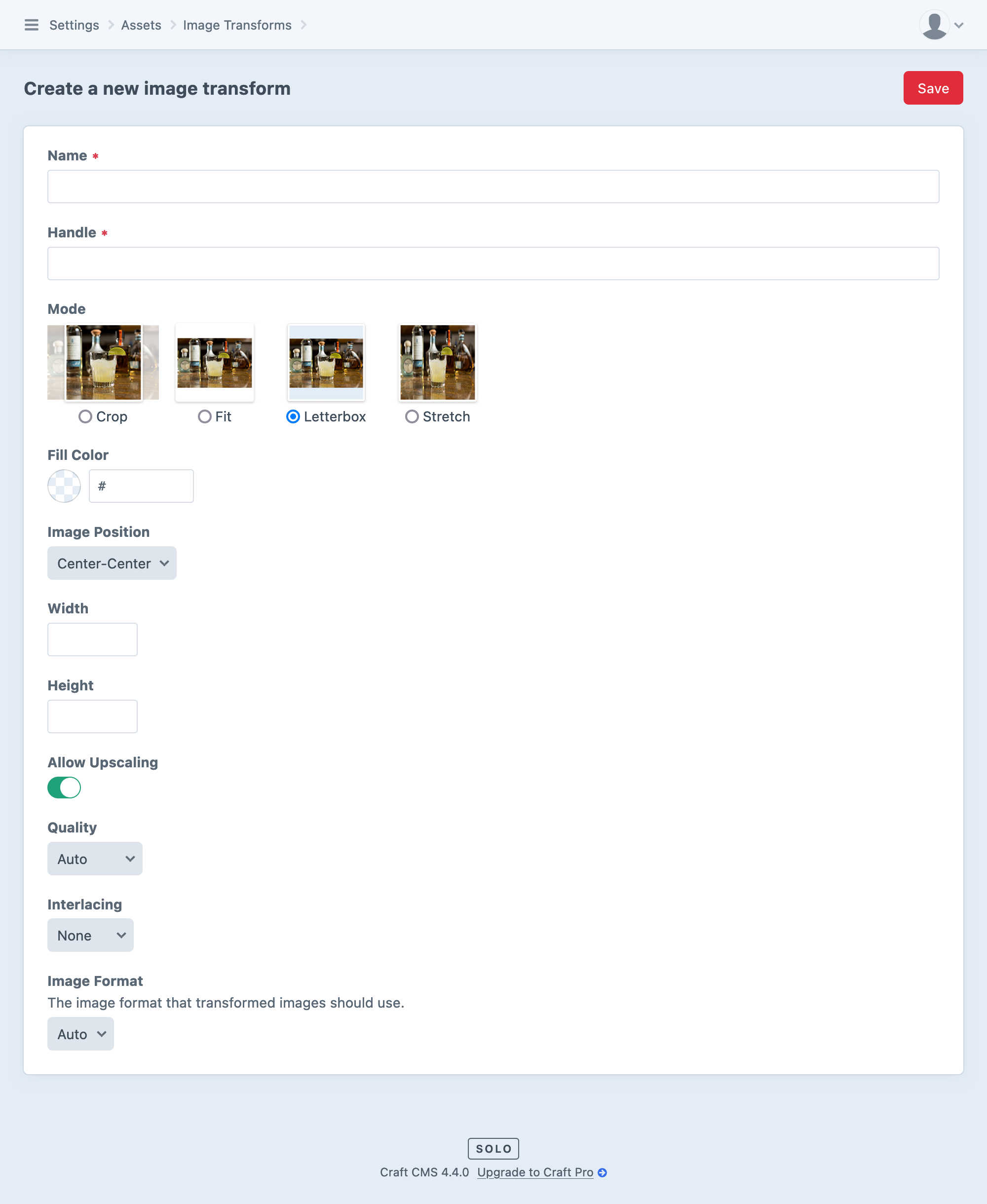
Every transform has the following settings:
- Name
A user-facing name or label for the transform. This is mostly for your reference, but it may be exposed to content authors when using Redactor (opens new window).
- Handle
A template-facing handle, used when accessing transforms in Twig or via GraphQL. Changing this may require updates to your templates!
- Mode
Specifies how the transform is handled:
- Crop (Default) — Crops the image to the specified width and height.
- Fit — Scales the image so that it is as big as possible with all dimensions fitting within the specified widthand height.
- Letterbox — Stretches the image to the specified width and height.
- Stretch — Stretches the image to the specified width and height.
All modes support some general controls over image size and quality:
- Width
Final transformed image width, or blank to calculate automatically from the original image’s aspect ratio.
- Height
Final transformed image height, or blank to calculate automatically from the original image’s aspect ratio.
- Allow Upscaling
Whether or not Craft is allowed to scale an image beyond its original dimensions. Affects the maximum Width and Height for Fit, Crop, and Stretch output, and the matting strategy for Letterbox transforms.
- Quality
Sets a quality or compression ratio for the transformed image, depending on the format of the target image. When left blank, the quality will be determined by the defaultImageQuality config setting.
- Interlacing
Specify an interlacing (opens new window) strategy for the pixels in raster images.
- Image Format
Format for the transformed image.
- Auto (same as source image, if web-safe (opens new window), otherwise
jpg) jpgpnggifwebp(when supported by ImageMagick)avif(when supported by ImageMagick)
The transformGifs setting allows you to completely disable transformation of GIF images. Animated GIFs often consume significant resources to resize, and rarely produce well-optimized output.
You do not need to update templates for this setting to work—Craft will just ignore the transform and return a URL to the original image.
- Auto (same as source image, if web-safe (opens new window), otherwise
Some modes may behave the same when using only one of the Width and Height settings. Typically, an unset dimension means the image’s aspect ratio is maintained.
Suppose we have a source image that is 600 pixels wide and 400 pixels tall. Applying a Stretch transform that only declares a Width of 60 pixels would produce an image 40 pixels tall.
#Transform Modes
Additional settings are available for some transform modes.
#Crop
When using the Crop mode, a Default Focal Point setting is revealed, allowing customization of which image area Craft should center the crop on when a focal point isn’t specified. Its options include:
| Label | Handle |
|---|---|
| Top-Left | top-left |
| Top-Center | top-center |
| Top-Right | top-right |
| Center-Left | center-left |
| Center-Center | center-center |
| Center-Right | center-right |
| Bottom-Left | bottom-left |
| Bottom-Center | bottom-center |
| Bottom-Right | bottom-right |
When a focal point is known for an image, Craft will attempt to keep that point as close to the center of the crop as possible.
#Fit
The Fit mode always respects the original image’s aspect ratio. The image is scaled to fit within the specified Width and/or Height, but may not cover the entire allowed area. Focal points have no effect when using this mode, as images are never cropped.
#Letterbox
Two new options are revealed when using the Letterbox mode:
- Fill Color — A hexadecimal color value used for the matte. When supported, the default matte is transparent; otherwise, white.
- Image Position — Where the image will be anchored, when it does not fill the entire target frame. The same anchoring options are available here as for the Default Focal Point option in the Crop and Fit modes.
Letterbox mode preserves images’ aspect ratios, fitting them within the provided width and height and filling the remaining space with the Fill Color. If the target frame is larger than the original image’s dimensions and the Allow Upscaling option is Off, Craft may matte the image on more than two sides.
#Stretch
Like Crop and Fit, Stretch is only differentiated from other transforms when used with a Height and a Width setting.
With both set, the image is scaled horizontally and vertically to the target size.
As the name of this mode suggests, using a target height and width that are a different aspect ratio than the original image will cause the image to be stretched disproportionately.
#Applying Named Transforms to Images
To output an image with your named transform applied, pass its handle into your asset’s getImg() (opens new window), getUrl() (opens new window), getWidth() (opens new window), and getHeight() (opens new window) functions:
<img src="{{ asset.getUrl('thumb') }}"
  width="{{ asset.getWidth('thumb') }}"
  height="{{ asset.getHeight('thumb') }}">
You can also apply the transform on the asset so any relevant properties are automatically manipulated by default. This example would output the same result as the example above:
{% do asset.setTransform('thumb') %}
<img src="{{ asset.url }}"
  width="{{ asset.width }}"
  height="{{ asset.height }}">
#Defining Transforms in your Templates
You can also define transforms directly in your templates by creating a hash with the desired parameters:
{% set thumb = {
  mode: 'crop',
  width: 100,
  height: 100,
  quality: 75,
  position: 'top-center'
} %}
See a list of all the possible keys and values for this object.
Then pass that hash into your asset’s getUrl(), getWidth(), and getHeight() functions:
<img src="{{ asset.getUrl(thumb) }}"
  width="{{ asset.getWidth(thumb) }}"
  height="{{ asset.getHeight(thumb) }}">
Notice in this example there are no quotes around “thumb” like there were in our earlier examples. That’s because before we were passing a string set to reference a control-panel-defined transform by its handle, whereas this example passes a variable containing the thumb options hash we created in the template.
It would look similar using setTransform() like we did in the previous section:
{% do asset.setTransform(thumb) %}
<img src="{{ asset.url }}"
  width="{{ asset.width }}"
  height="{{ asset.height }}">
#Possible Values
All the same settings available to named transforms are available to template-defined transforms and transforms requested via GraphQL.
- The
modeproperty can be set to either'crop','fit','letterbox', or'stretch'. widthandheightcan each be set to an integer, or omitted.qualitycan be set to a number between 0 and 100, or omitted to use the defaultImageQuality setting.formatcan be set to'jpg','gif','png','webp','avif', or omitted.- A
positionproperty (set to one of the valid values listed above) is supported whenmodeis set to'crop'or'letterbox'. The behavior is different for each type of transform.
#Overriding Named Transforms
Should you need to break from a named transform in a few places, you can specify overrides alongside a transform key:
{% do asset.setTransform({
  transform: 'thumb',
  quality: 100,
}) %}

<img
  src="{{ asset.url }}"
  width="{{ asset.width }}"
  height="{{ asset.height }}">
This would accomplish the same thing as the example before it, except quality would be maxed out at 100 rather than whatever was set on the named 'thumb' transform.
You can override settings like this with the getUrl() method, too:
<source type="image/webp" srcset="{{ asset.getUrl({
  transform: 'thumb',
  format: 'webp',
}) }}">
This would use the named 'thumb' transform’s settings, but always generate a .webp file.
#Generating srcset Sizes
Transforms are a great way to avoid serving unnecessarily-large images to your users—but there’s still room for optimization! Most browsers support the srcset (opens new window) attribute, which allows you to define a collection of images that are appropriate for a given device or viewport.
Rather than creating an exhaustive list of named transforms or building up multiple config hashes in your templates, you can offload this work to Craft with the getSrcSet() (opens new window) method. Here’s an example that uses the tag template function to render an image with a srcset attribute containing three variations based on a single transform:
{% do asset.setTransform({ width: 300, height: 300 }) %}
{{ tag('img', {
  src: asset.url,
  width: asset.width,
  height: asset.height,
  srcset: asset.getSrcset(['1.5x', '2x', '3x']),
  alt: asset.title,
}) }}
This can be done even more succinctly by passing a second sizes argument to the getImg() (opens new window) method:
{{ asset.getImg({ width: 300, height: 300 }, ['1.5x', '2x', '3x']) }}
Don’t forget to configure the corresponding sizes attribute, as well—Craft can manage the transforms and build a valid srcset, but it doesn’t know how the images are actually used in your front-end!
You can also provide relative image sizes when eager-loading asset transforms. See AssetQuery::withTransforms() (opens new window) in the class reference for an example.
#GraphQL
When requesting asset data via the GraphQL API, you can get named and ad-hoc transforms with the @transform directive.
Like we’ve seen in the template-defined transforms, the GraphQL API allows you to retrieve individual properties as though they were tied to a transform…
query Thumbnails {
  assets(volume: "images") {
    title
    alt
    url @transform(width: 640, mode: "fit")
    width
    height
  }
}
{
  "data": {
    "assets": [
      {
        "title": "Warm Springs",
        "alt": "Snow-dusted plateau.",
        "url": "https://my-project.ddev.site/uploads/images/_640xAUTO_fit_center-center_none/8/warm-springs.jpg",
        "width": 6000,
        "height": 4000
      },
      {
        "title": "Highway 26",
        "alt": "Winter scene near Warm Springs, Oregon",
        "url": "https://my-project.ddev.site/uploads/images/_640xAUTO_fit_center-center_none/3/highway-26.jpg",
        "width": 6000,
        "height": 4000
      }
    ]
  }
}
…or set a transform on the entire asset object:
query Gallery {
  assets(volume: "images") @transform("fullscreen") {
    title
    alt
    url
    width
    height
  }
}
{
  "data": {
    "asset": {
      "title": "Warm Springs",
      "alt": "Highway 26, south of Warm Springs, Oregon",
      "url": "https://my-project.ddev.site/uploads/images/_fullScreen/8/warm-springs.jpg",
      "width": 2560,
      "height": 1707
    }
  }
}
Note that in the first example, the height and width values are for the original image, whereas in the second example, they reflect the transformed dimensions.