Custom Fields
On their own, elements only provide a scaffold for your content—the content itself will be stored in fields.
Fields are defined in Settings → Fields, and are organized into Field Groups for convenience. Field layouts and conditions determine where and when your fields should appear for content authors.
All fields share a few settings:
- Group – The field group that the field is filed into;
- Name – How the field will be labeled throughout the control panel;
- Handle – How the field will be referenced from your templates;
- Instructions – Instruction text to guide authors;
- Field Type – What type of field it is;
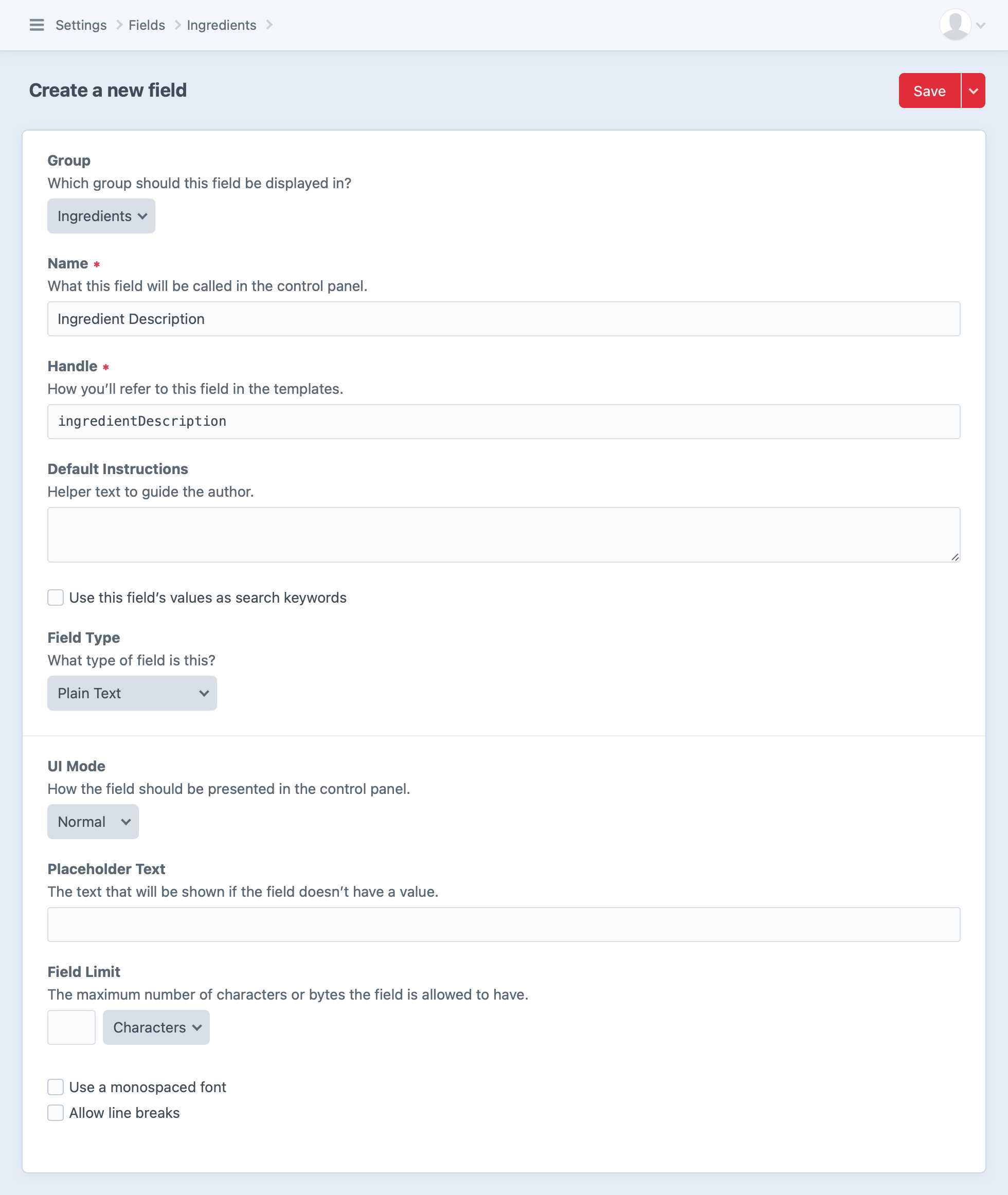
A field’s name and instructions can be overridden when adding it to a layout.
#Field Types
Choosing a field type determines what the field’s input UI is going to look like, how it stores data, and how you’ll interact with that data in your templates.
Craft comes with the following built-in field types:
| Type | Description |
|---|---|
| Assets | Attach asset elements. |
| Categories | Attach category elements. |
| Checkboxes | Select any number of values from a list. |
| Color | Choose a color with the browser’s color picker UI. |
| Countries | Select from a list of countries available in address elements. |
| Date | Choose a date and/or time, as well as a timezone. |
| Dropdown | Choose one value from a list. |
| Validate text input as an email address. | |
| Entries | Attach entry elements. |
| Lightswitch | Toggle a binary option. |
| Matrix | Repeat nested sets of fields. |
| Money | Input a numeric value and choose a currency. |
| Multi-select | Select any number of values from a list (same as checkboxes, but a different UI). |
| Number | Input a numeric value. |
| Plain Text | Input arbitrary text. |
| Radio Buttons | Choose one value from a list. |
| Table | Add rows of similar data. |
| Tags | Attach tag elements, or create new ones on-the-fly. |
| Time | Set a time of day, without a date or timezone. |
| URL | Validate text as a URL/URI. |
| Users | Attach user elements. |
#Translation Methods
If you’re running a multi-site Craft installation, most of your fields will have a “Translation Method” setting (depending on their type).
Fields can have the following translation method:
- Not translatable – The field will have the same value across all sites.
- Translate for each site – The field can have a different value for each site.
- Translate for each site group – The field can have a different value for each site group.
- Translate for each language – The field can have a different value for each unique language associated with your sites.
- Custom… – The field can have different values based on a custom differentiator.
If you choose “Custom…”, a “Translation Key Format” setting will appear below, where you can define a template that will help Craft which sites to copy the field value over to. When a new field value is saved, Craft will render this template for all sites, and the field value will be copied to all sites where the translation key matches the original site’s.
For example, if a field’s translation key format were {site.handle[0:2]}, then new field values would be copied over to any other sites where the first two characters of the site handle matches the first two characters of the original site’s handle.
If the translation key format returns an empty string (''), the field will not indicate that it’s available for translation. A key format of {section.handle == 'blog' ? site.handle : ''}, for example, would display its field as translatable per site from only the blog section—otherwise it would not be available for translation in any other context.
#Field Layouts
Once you’ve created your fields, you can display them in your edit forms by adding them to “field layouts.”
Everything in Craft that has content associated with it will expose a configurable field layout:
- Entries use the field layout defined by their entry type in Settings → Sections → Edit Entry Types → [entry type name] → Field Layout.
- Global sets each get their own field layout, defined in Settings → Globals → [global set name] → Field Layout.
- Assets use the field layout defined by their asset volume in Settings → Assets → [asset volume name] → Field Layout.
- Categories use the field layout defined by their category group in Settings → Categories → [category group name] → Field Layout.
- Tags use the field layout defined by their tag group in Settings → Tags → [tag group name] → Field Layout.
- Users share a single field layout defined in Settings → Users → User Fields.
- Addresses also share a field layout, which can be found alongside Users in Settings → Users → Address Fields.
The field layout editor works the same way regardless of which content type you’re looking at:
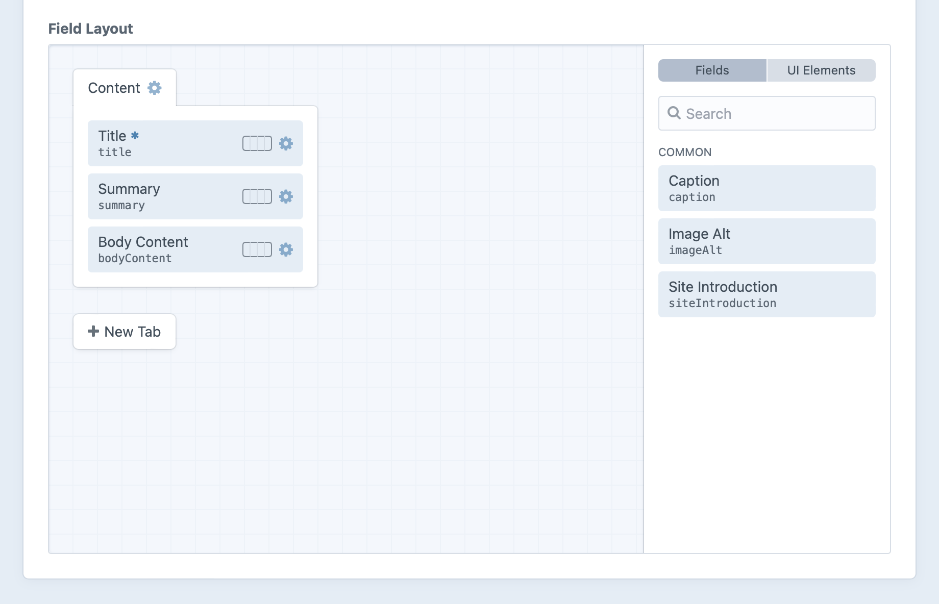
#Tabs
Every layout starts with a “Content” tab at the top. Add more tabs with the New Tab button, or update an existing tab by clicking its gear icon (
If the field layout has only one tab (or only one tab is visible due to applied conditions), its fields will be displayed in the editor without the tab itself—so its name will not be visible until more tabs are added.
A tab’s settings include its name and optional conditions that determine when it will be displayed for editors:
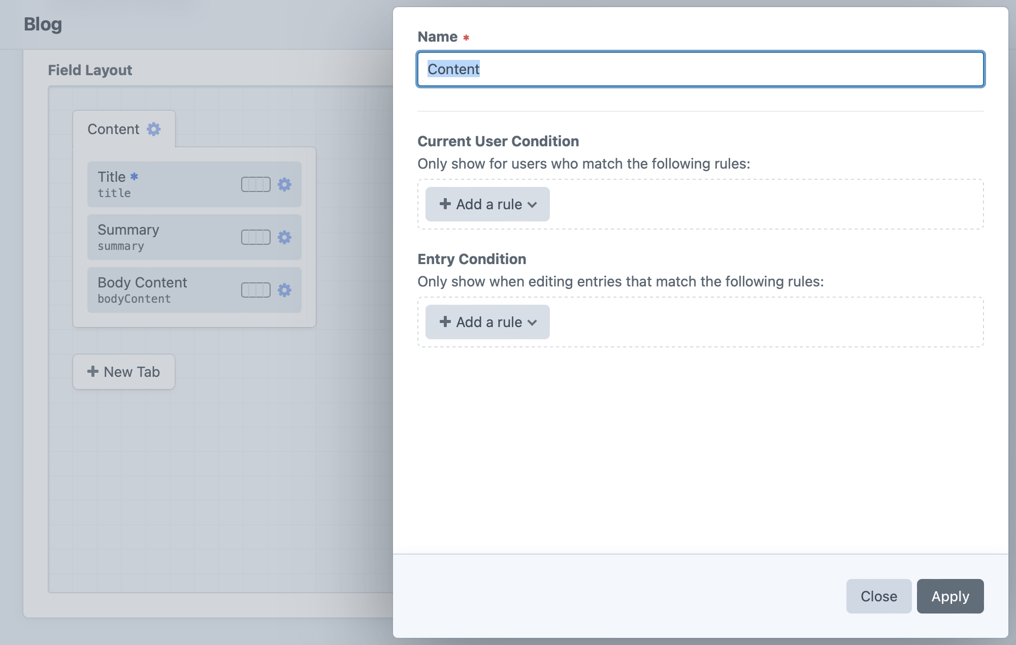
- Name – the label displayed for the tab when it’s visible in the editor.
- Current User Condition – optional rules for determining which users should see the tab in the editor. (When the tab is not displayed, its fields are hidden regardless of their individual conditions.)
- Element Condition – optional rules (based on the current element) that determine when the tab and its fields should be displayed in the editor.
#Fields
Add however many fields you’d like to each tab, dragging them into your desired order. (Most layouts include a Title field by default.) Any available fields and UI elements will be available off to the side, where you can drag them from the sidebar into your field layout. You can move fields back to the sidebar and out of your field layout—unless they’re mandatory fields required to be in the layout—but take care not to remove any fields already being used for important content.
By default, each field will be displayed at the full width (100%) of its tab. You can use the field width control, however, to designate a column size. This can be 25%, 50%, 75% or the default 100% width. You can use this to have fields appear side by side as long as the content editor’s browser window is wide enough. (Otherwise, the fields may still be shown at full width.)
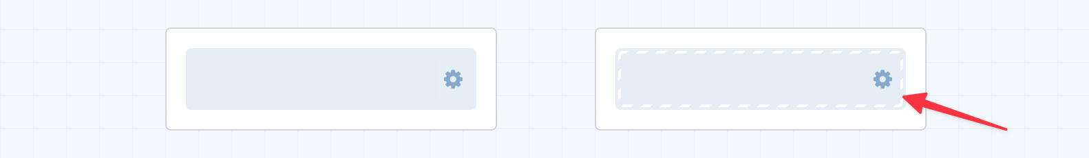
Click the gear icon (
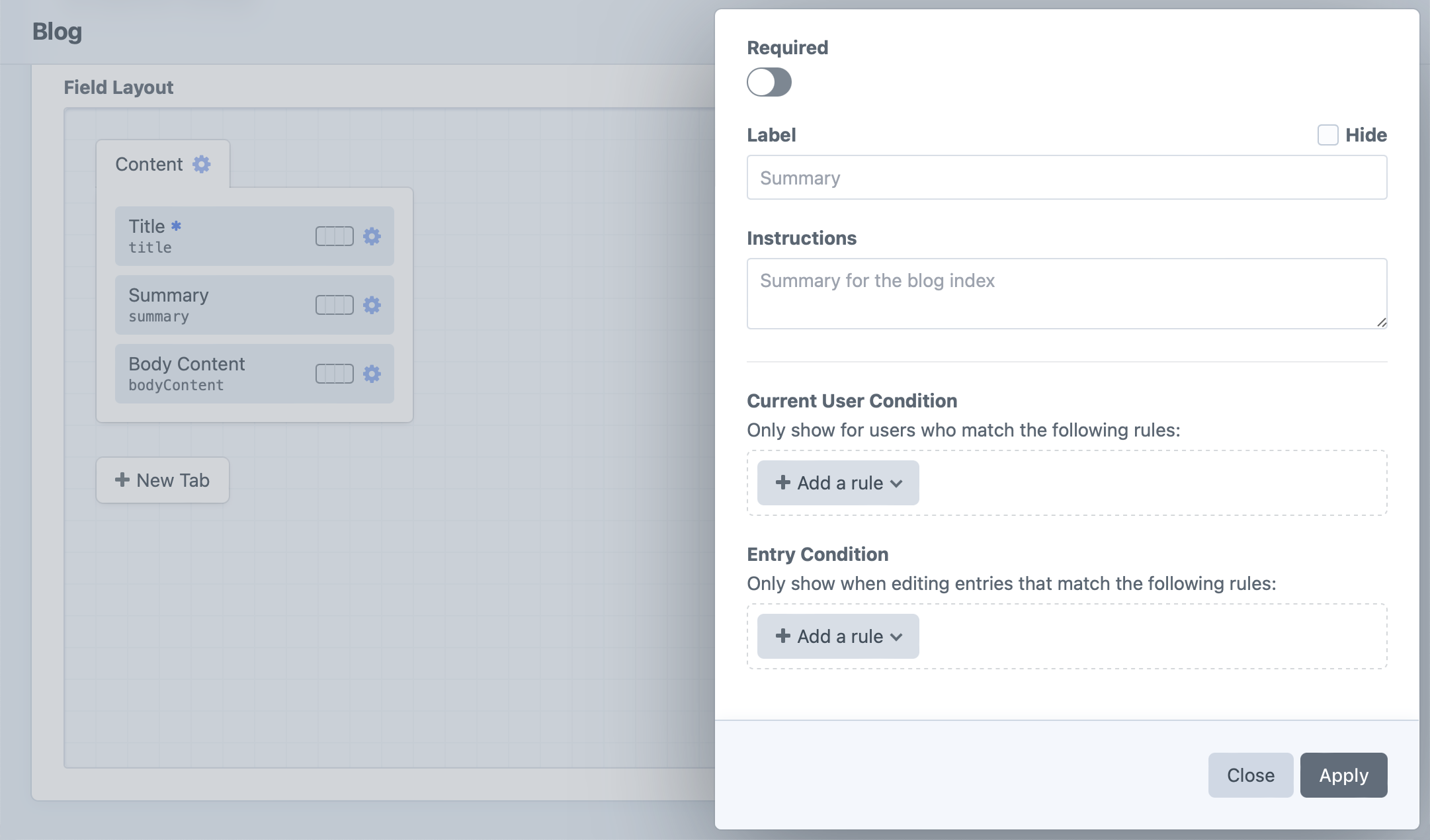
The field’s settings let you control if and how it’s displayed:
- Required – when switched on, does not allow the field to be left empty.
- Label – override for the label already given to that field.
- Instructions – override for the instructions already given to that field.
- Current User Condition – optional rules for determining which users should see the field in the editor.
- Element Condition – optional rules (based on the element) that determine when the field should be displayed in the editor.
A field that’s required will have an asterisk (
#Field Conditions
Any fields that have condition rules on them are displayed with a caution strip: