Custom Fields
On their own, elements only provide a scaffold for your content—most of the content itself will be stored in fields.
Fields are managed in
- Settings
- Fields
#Field Types
Choosing a field type determines what the field’s input UI is going to look like, how it stores data, how you’ll use that data in templates, and the way you query against that data.
#Field Settings
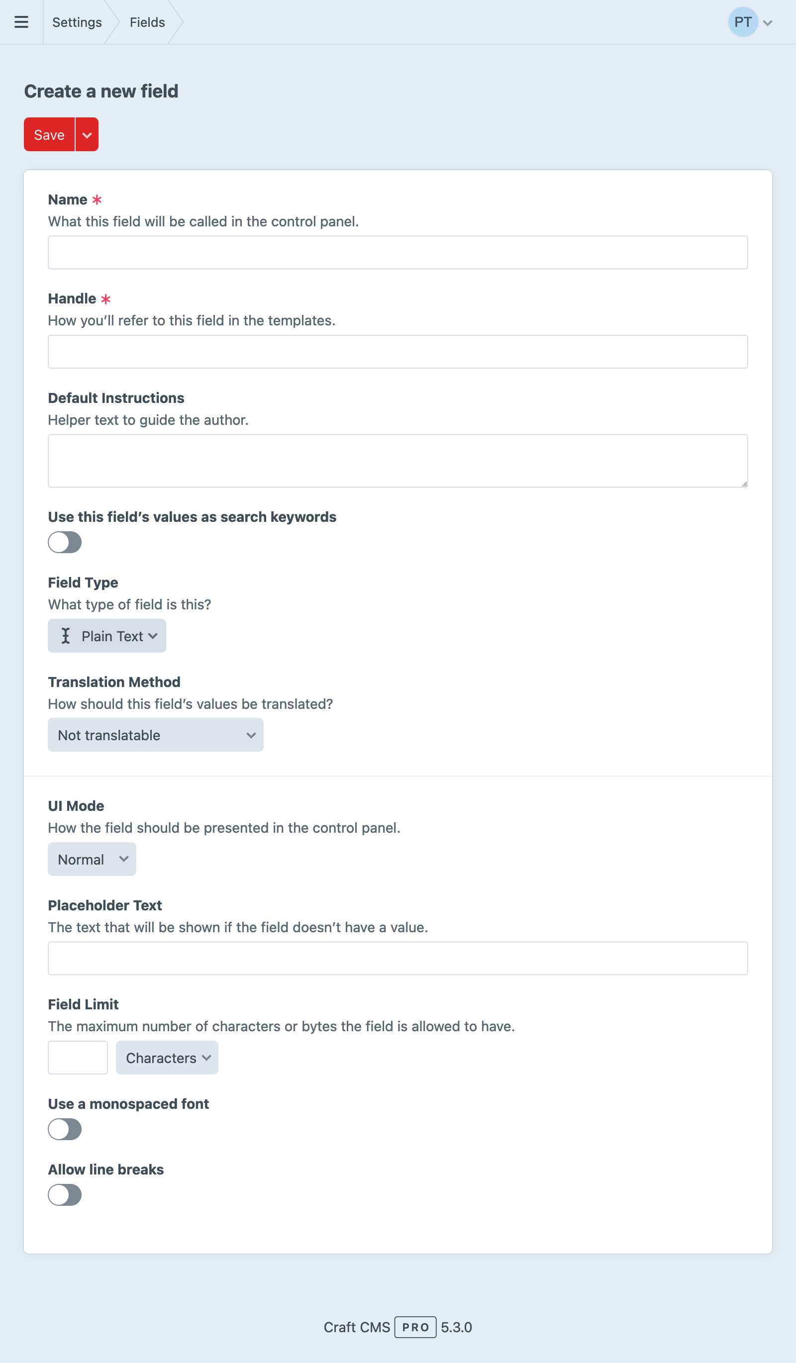
Most field types share these core settings:
- Name
- The user-facing label for the field. This should identify the field reasonably well among other fields, and be descriptive enough for authors. You can override this in a field layout.
- Handle
- A developer-facing identifier for the field, used to access or query by its value from code. Every field must have a unique handle. You can override this in a field layout.
- Default Instructions
- Text displayed to authors in the field layout. Basic Markdown formatting is supported. You can override this in a field layout.
- Translation Method
- How Craft handles the field’s value for elements that exist in multiple sites. See Translation Methods below for more information.
A field’s name, instructions, and handle can be overridden when adding it to a layout.
Multi-instance fields are distinguished by those overridden names and handles; every field in a layout must have a unique handle.
#Handles
Craft will auto-generate a Handle as you enter a Name, but you can adjust it however you see fit.
Some handles are reserved so that custom fields don’t collide with native element attributes.
Handles are used when accessing field data from code:
<div class="summary">
  {# Display a plain text field: #}
  <p>{{ entry.summaryShort }}</p>
</div>
They’re also how you query by a field’s value:
{# Filter by the value of a lightswitch field: #}
{% set featuredPosts = craft.entries()
  .isFeatured(true)
  .all() %}
Refer to each field type’s documentation for information about what kinds of data it returns, and how to use it in your templates!
#Translation Methods
If you’re running a multi-site Craft installation, most of your fields will have a Translation Method setting.
Fields can have the following translation method:
- Not translatable – The field will have the same value across all sites.
- Translate for each site – The field can have a different value for each site.
- Translate for each site group – The field can have a different value for each site group.
- Translate for each language – The field can have a different value for each unique language associated with your sites.
- Custom… – The field can have different values based on a custom differentiator.
If you choose Custom…, a Translation Key Format setting will appear below, where you can define an object template that determines how Craft copies the field’s value to other sites. When an element that uses the field is saved, Craft renders this template for each site the element exists in, and copies the value to any that produce the same key.
For example, if a field’s translation key format were {site.handle[0:2]}, then new field values would be copied over to any other sites where the first two characters of the site handle matches the first two characters of the original site’s handle. Looking at this from the opposite direction: any site that produces a unique translation key for a field will have its value isolated from other sites.
If the translation key format returns an empty string (''), the field will not appear as translatable, and its value will not be copied to any other sites. A key format of {section.handle == 'blog' ? site.handle : ''}, for example, would display its field as translatable per-site from only the blog section—in all other contexts, it would not be translatable.
Keep in mind that fields can be attached to multiple element types. Accessing invalid properties of the current element (like section on an asset) may cause the key to end up blank (and therefore not translated).
#Field Layouts
Everything in Craft that has content associated with it will expose a configurable field layout, to which you can add your fields:
- Entries use the field layout defined by their entry type in
- Settings
- Entry Types
- Entry Type
- Field Layout
- Global sets each get their own field layout, defined in
- Settings
- Globals
- Global Set
- Field Layout
- Assets use the field layout defined by their asset volume in
- Settings
- Assets
- Asset Volume
- Field Layout
- Categories use the field layout defined by their category group in
- Settings
- Categories
- Category Group
- Field Layout
- Tags use the field layout defined by their tag group in
- Settings
- Tags
- Tag Group
- Field Layout
- Users share a single field layout defined in
- Settings
- Users
- User Fields
- Addresses also share a field layout, which can be found alongside Users in
- Settings
- Users
- Address Fields
The field layout editor works roughly the same way, regardless of which element type you’re configuring:
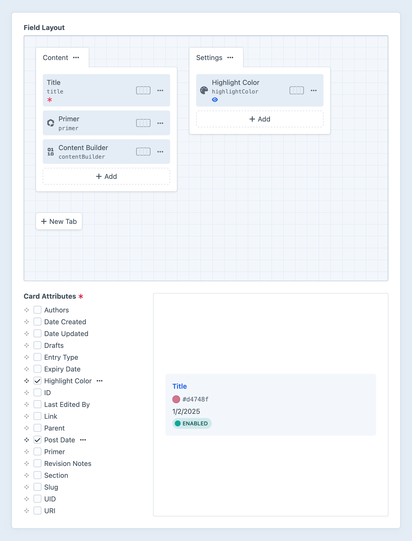
Fields and other element-specific attributes can also be added to element cards using the card designer.
#Tabs
Every layout starts with a Content tab. Add more tabs with the New Tab button, or update an existing tab by clicking its action button (
When editing an element, if its field layout has only one tab (or only one tab is visible due to applied conditions), the fields within it will be displayed without the tab or tab bar. Its name will not be visible until there are at least two tabs.
A tab’s settings include its name and optional conditions that determine when it will be displayed for editors:
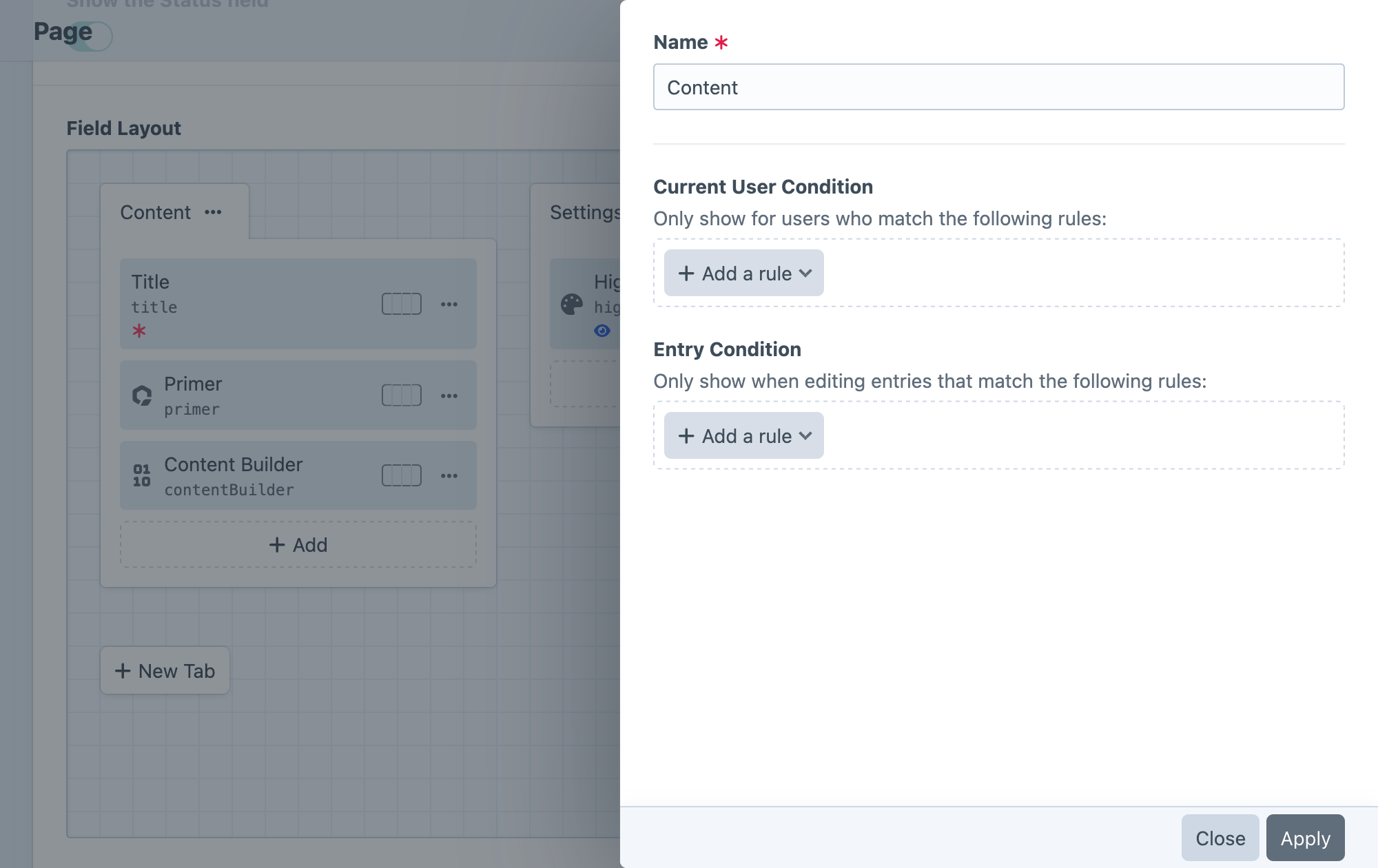
- Name – the label displayed for the tab when it’s visible in the editor.
- Current User Condition – optional rules for determining which users should see the tab in the editor. (When the tab is not displayed, its fields are hidden regardless of their individual conditions.)
- Element Condition – optional rules (based on the current element) that determine when the tab and its fields should be displayed in the editor.
#Field Layout Elements
Add fields to any tab using the + Add button, then dragging them into the desired order. Most layouts include at least a Title field by default—even if it’s marked as hidden. To remove a field, select Remove from its action
Take care when removing a field from a layout: Craft stores field content using each instance’s UID. Re-adding a field (whether or not it uses the same handle) will give it a new UID, meaning it will no longer be associated with existing content! By relegating these changes to a development environment, your live data is typically insulated from major loss—if you do mistakenly remove a field, you can always roll back the corresponding project config changes via git before deploying.
Moving field layout elements between tabs, however, is nondestructive.
By default, each field will be displayed at the full width (100%) of its tab. Use the field width control to adjust this in increments of 25%. Fields can appear side by side as long as the content editor’s browser window is wide enough. On narrow screens, fields may be shown at full width, even if they are configured differently.
Click the action button (
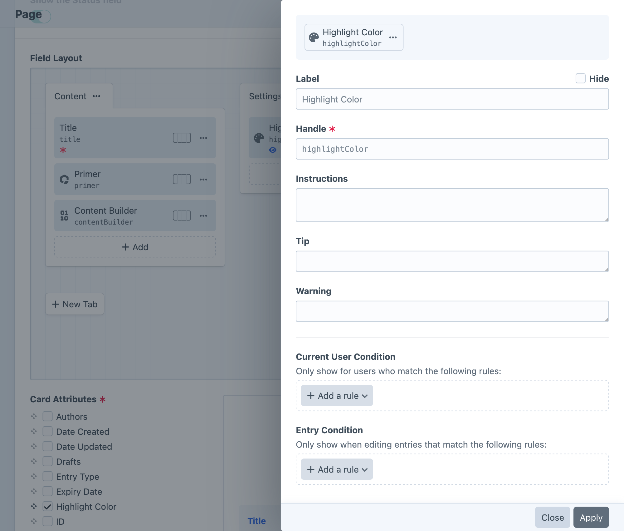
The field’s settings let you control how and when it’s displayed:
- Label – Override the field’s default label, or hide it entirely.
- Handle – Override the field’s handle.
- Instructions – Override the field’s default instructions.
- Current User Condition – Set rules for determining which users can see the field and change its value.
- Element Condition – Set rules (based on the current element) that determine when the field should be displayed in an editor.
- Required – When a field is marked as Required, the element only validate when a value is present in the field. This may have different effects on different field types.
- Use this field’s values for element thumbnails — For fields that can be used as thumbnails in chips and cards, this option will appear.
- Include this field in element cards — Any fields with this enabled will appear whenever the element is rendered as a card. Fields that are also eligible for use as a thumbnail may be displayed twice!
Only one field can be used as an element’s thumbnail at a time.
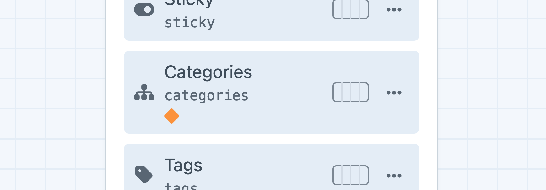
Some field layout elements’ settings are bubbled up to the layout designer as indicators, beside the field’s name:
- An asterisk () means the field is Required.
- A diamond means that it has been assigned one or more user or element condition rules.
- A photo icon means the field will be used as the thumbnail in element chips and cards.
- An eye means the field will appear in element cards.
- A pencil icon indicates that the field contains overridden settings.
You can also edit the original field’s configuration by selecting Edit global field settings from its action menu.
#Multi-Instance Fields New!
Most fields can be added to a single layout multiple times. Craft will automatically assign a new handle to fields that are used more than once in a layout. To customize a field’s handle for a given layout, click its action button (
Multi-instance fields behave as though they were entirely different fields, in almost every situation: templates, element queries, condition builders, search, and so on. The field layout will retain a reference to the underlying field, so any settings updated for the base field will be reflected on each instance. For example, a plain text field named “Attribution” could be used two (or more) times in a single entry type’s field layout: once for an article “Byline,” then again as “Photo Credit.” In a template, you would use those fields exactly like any other field:
{% set image = entry.image.one() %}

<article>
  {% if image %}
    <figure>
      {{ image.getImg() }}
      <figcaption>{{ entry.photoCredit }}</figcaption>
    </figure>
  {% endif %}

  <h2>{{ entry.title }}</h2>
  <address rel="author">{{ entry.byline }}</address>

  {# ... #}
</article>
This example uses the same “Attribution” field as photoCredit and byline, each storing its own content. You can target one instance of a field with element queries, just as you’d expect:
{% set postsMissingImageAttribution = craft.entries()
  .section('blog')
  .image(':notempty:')
  .photoCredit(':empty:')
  .count() %}
Conversely, adding one field to multiple different layouts (using the same handle—either its original handle, or by renaming each of them the same way) allows you to query across all instances. Craft quietly reconciles those field handles and builds the query appropriately:
{% set products = craft.entries()
  .section('products')
  .manufacturer('ACME%')
  .all() %}
{# -> Products made by ACME Labs and ACME Inc. across multiple product “types” with similar field layouts #}
This example assumes you have multiple entry types in a “Products” section, each using a centrally-defined, generic “Product Details” field—one instance of which per layout using the name “Manufacturer” and handle manufacturer.
#Conditions
Any fields (or tabs) that have a condition configured will display an orange rhombus.
Conditions determine when (and to whom) a field or tab is displayed and editable. You can create sophisticated editorial processes by exposing parts of the authoring interface only when specific criteria are met.
Conditions are not intended as complete substitute for permissions! It’s still important to configure sensible base permissions for your editors.
However, Craft only populates fields that are visible and editable to a given user, regardless of context; as a result, your front-end forms are automatically protected against clever manipulation of POST values.
#Visibility Conditions
Two conditions are available to determine when a field (or tab) is visible within a field layout, and whether it will be validated:
- Current User Condition — Evaluated against the user that is currently editing the element.
- Element Type Condition — Evaluated against the element being edited. Available rules depend on the element type, its configuration (i.e. entry type or asset volume), and the field layout.
As you edit an element, the visibility of conditional fields is determined while auto-saving. Take care when designing a field layout to avoid major visual shifts as fields are shown or hidden. Only visible fields are validated.
Prior to Craft 5.7.0, these were the only two condition builders, and the UI did not explicitly group them into Visibility Conditions.
#Editability Conditions 5.7.0+
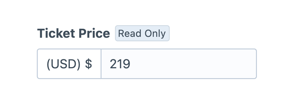
User and element conditions completely hide field layout elements when their criteria are not met. If you would prefer to make a field read-only or “static” in some situations (so that authors can still reference its value), you can move conditions into the Editability Conditions.
To be editable, a field must also be visible.
It’s possible to short-circuit validation with editability conditions! Fields marked as Required will prevent authors from applying a draft, even if they aren’t able to provide a value.
#UI Elements
Switch to the UI Elements tab in the New field popover to add special field layout elements:
- Heading — Create a label that splits up form inputs, within a tab.
- Tip + Warning — Display a Markdown message with the corresponding urgency. Enable the Can be dismissed? setting to allow authors to hide a message in the current browser (using the
localStorageAPI). - Template — Render a Twig template from your
templates/directory. The template will receive the element being edited under anelementvariable. - Horizontal Rule — A thin divider line. Subsequent fields will start in a new row.
- Line Break — An invisible element that ensures the next field is rendered in a new row.
- Markdown — Renders a multi-line Markdown snippet. HTML is encoded prior to parsing as Markdown; if you want to add arbitrary HTML, use the Template UI element.
In addition to their own options (accessible via their
#Card Designer 5.5.0+
Below the field layout designer, you can add previews of field and attribute data to the card representation of that element. Note that values that appear in the card preview do not represent the content of any specific element.
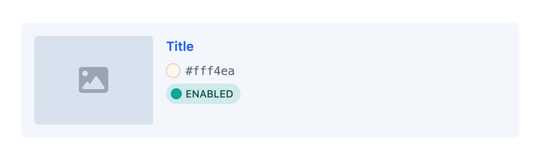
#Thumbnails
Card thumbnails are assigned using the main field layout designer. Select Use for element thumbnails from the action
Only one field can be used as the thumbnail source at a time. Additional asset fields’ values can be displayed in the card body, as chips.
#Generated Fields
In addition to the native attributes and custom fields added to an element’s field layout, you can add any number of Generated Fields that expose pre-computed values on the associated elements.