Control Panel
The control panel is one of Craft’s greatest strengths. Developers and content authors appreciate its smart design and powerful feature set:
- Locate and edit content quickly and confidently;
- Design a schema that makes sense for your site or application;
- Customize views into deep and complex data;
- Invite users and work collaboratively;
- Find, install, and configure first- and third-party plugins;
We are working to make these features available to everyone as part of our established accessibility remediation process (opens new window).
If this is your first time using Craft, it might feel a little bit empty—don’t worry, that’s by design! Craft doesn’t impose a content model on your site, so you won’t see any default features like posts or pages—instead, you’re given tools to create the features you do need from agnostic element types and other settings.
#Tour
The appearance and organization of the control panel can differ based on what types of content you’ve set up, your permissions, user preferences, and the environment—but the general structure will always be the same.
Craft also has multiple editions, some of which give you access to additional control panel features.
Let’s take a quick spin around a typical control panel screen.
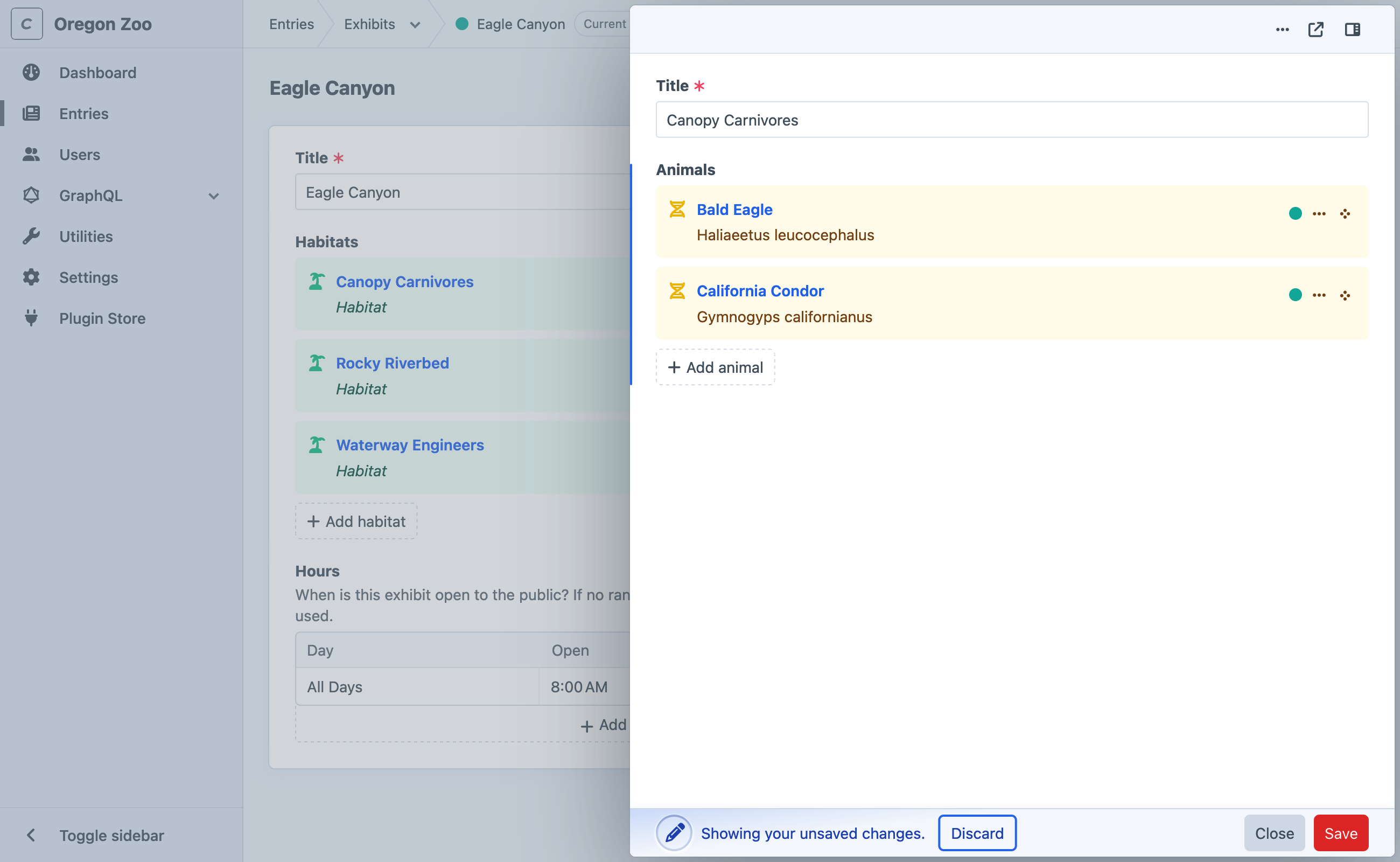
- Global sidebar
Contains the system name and icon, followed by the primary navigation. Each of the control panel’s main sections is linked, when configured (and your user has the related permission). Pick the Toggle sidebar button to collapse it and make more room for the page content.
Some items in the primary navigation contain nested links. Those lists are automatically expanded based on the current screen’s URI, or when you pick the Open subnavigation toggle.
- Global header
Contains breadcrumbs (when working with nested content or settings), actions for the current screen, and the user menu.
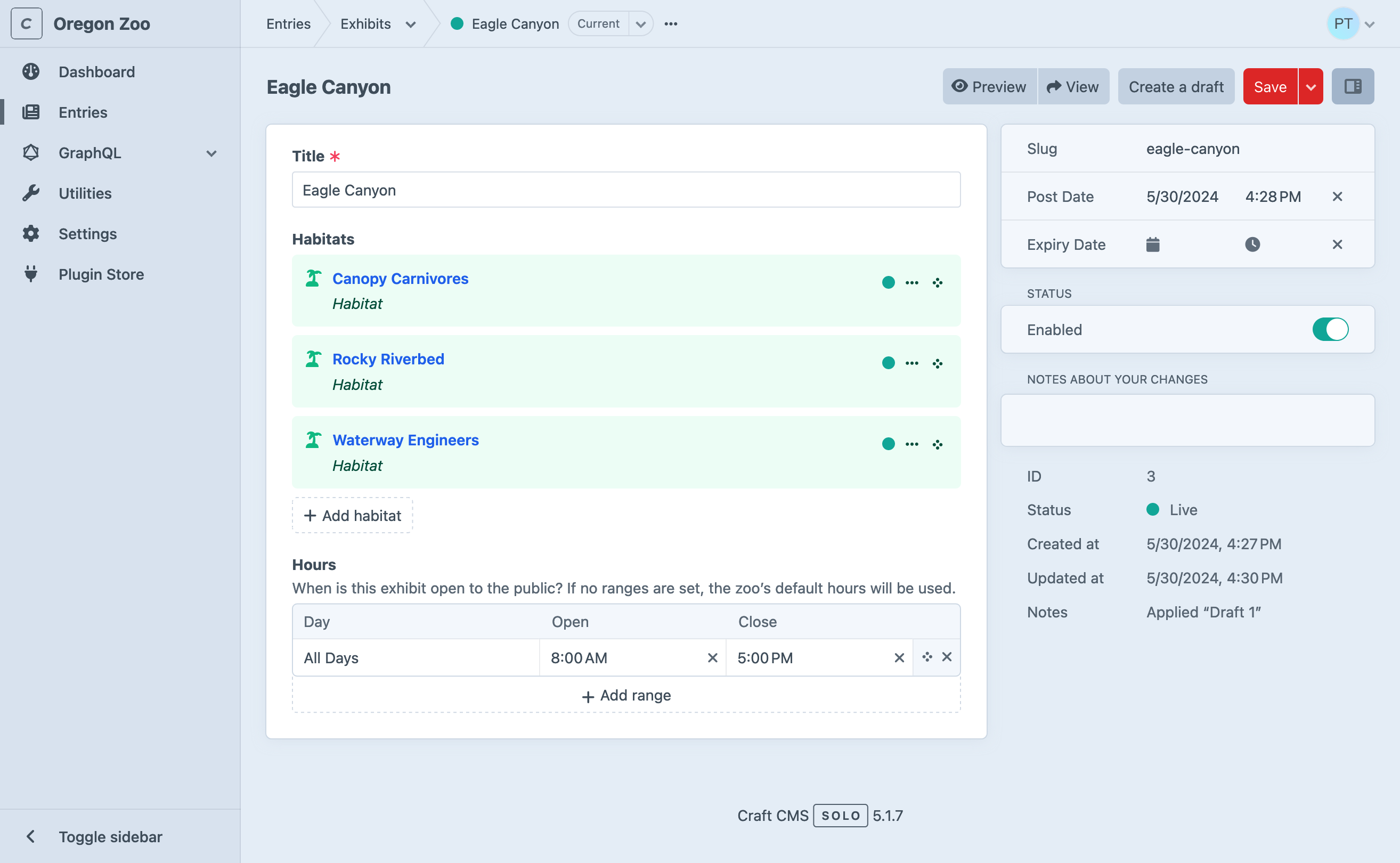
- Main container
The page’s main region typically contains editable content or settings, as well as secondary navigation and a sidebar.
- A header displays the page’s title and actions for the current screen.
- On element edit screens, a recent activity region holds information about any other users that may be viewing or editing that element.
- Secondary navigation contains links to adjacent pages (like other utilities, element sources, or related settings). Like the global menu menu’s content tends to be stable between the linked pages, but it may not be present when viewing more deeply-nested resources.
- The content area’s structure and substance can vary dramatically between areas of the control panel.
- Tabs may split the screen’s content or settings into logical groups (not pictured). The selected tab is appended to the current URL as a hash.
- When present, the nested sidebar is a mix of editable and read-only metadata.
- A header displays the page’s title and actions for the current screen.
You will see these same page components crop up in other screens—and even in slideouts!
The control panel includes skip links to a number of landmarks present in the current screen. Use the Disable autofocus accessibility preference to prevent search inputs or other UI from being focused when navigating.
#Main Sections
You may not see (or need) all these sections in your main navigation. They’ll appear only when Craft determines that they’ll be useful to the logged-in user—for example, Categories is hidden until you’ve configured at least one Category Group.
| Section | Description |
|---|---|
| Dashboard | Customizable landing page. |
| Assets | Create and edit asset elements. |
| Entries | Create and edit entry elements. |
| Categories | Create and edit category elements. |
| Globals | Edit content in global sets. |
| Users | TeamPro View and moderate users. |
| GraphQL | Configure GraphQL schemas, create tokens, and access the built-in playground. |
| Utilities | Get system info and perform a variety of upkeep actions. |
| Settings | Configure Craft’s system settings and content model. |
| Plugin Store | Browse, install, and purchase Craft and plugin licenses from the official Plugin Store. |
| …and more! | Some plugins provide their own control panel screens; others may only have a pane in the Settings section. |
#Announcements
Keep an eye on the global header for a
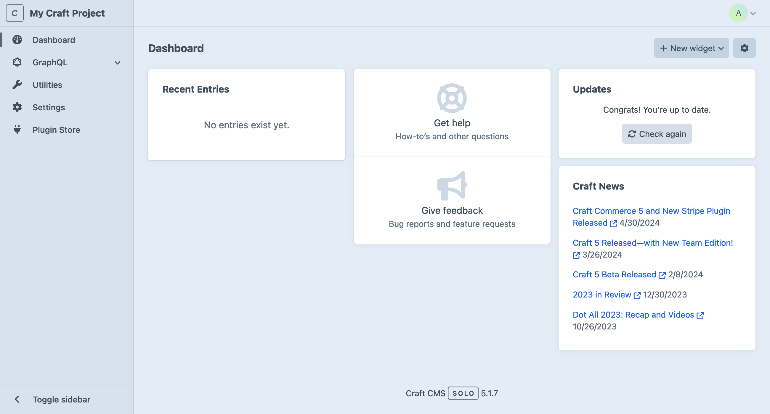
#Dashboard
After logging in, control panel users are directed to their dashboard. Each user manages their own dashboard, which is comprised of widgets. Craft comes with a few widgets:
- Support: Get official support from the Craft team.
- Feed: Scrape an external RSS feed.
- Drafts: Viewing your unpublished entry drafts.
- New Users: Visualize new registrations.
- Quick Post: Provide a simplified entry form for publishing new content with one click.
- Recent Entries: Display a list of recently-posted entries from one or more sections.
- Updates: Keep tabs on Craft and plugin updates.
Widgets can be rearranged, resized, and customized based on the user’s needs, and will be available to them wherever they log in.
Plugins can register their own widgets!
#Utilities
Utilities expose bundles of miscellaneous functionality to users with the correct permissions.
All Craft installations will include these utilities:
- Updates: View Craft and plugin updates, and apply them (when allowAdminChanges is on).
- System Report: Get information about the Craft installation and server.
- Project Config: View the state of Project Config.
- PHP Info: Additional information about your server’s PHP installation.
- System Messages: Customize email messages that are sent by the system.
- Asset Indexes: Rebuild an asset volume from its underlying storage medium.
- Queue Manager: Audit running and queued background jobs.
- Caches: Flush caches for various parts of the Craft application.
- Deprecation Warnings: View or clear deprecation warnings generated by templates and plugins.
- Database Backup: Capture and download a backup of Craft’s primary database.
- Find and Replace: Search for (and replace) a string across all element content.
- Migrations: View (and apply) pending migrations, or view a history of all previously-run content migrations.
Plugins can register utilities, and Craft will give each one a corresponding permission.
Access to utilities should be granted only to trusted users, especially the innocuous System Messages pane. Messages can include arbitrary Twig code, which effectively gives the author access to the entire Craft API—including the ability to modify their own permissions.
Keep in mind that any user marked as an “Admin” implicitly has access to all utilities.
#Disabling Utilities
You can disable a utility for all users with the disabledUtilities config setting.
Refer to each utility class (opens new window)’s id() method for their handles (including those provided by plugins), or inspect its URL in the control panel—the handle is the last segment (i.e. system-messages in /admin/utilities/system-messages).
#Settings
The Settings screen is where you’ll configure the system and design your content model. Settings complement configuration are typically stored in Project Config so that you can easily deploy them to other environments.
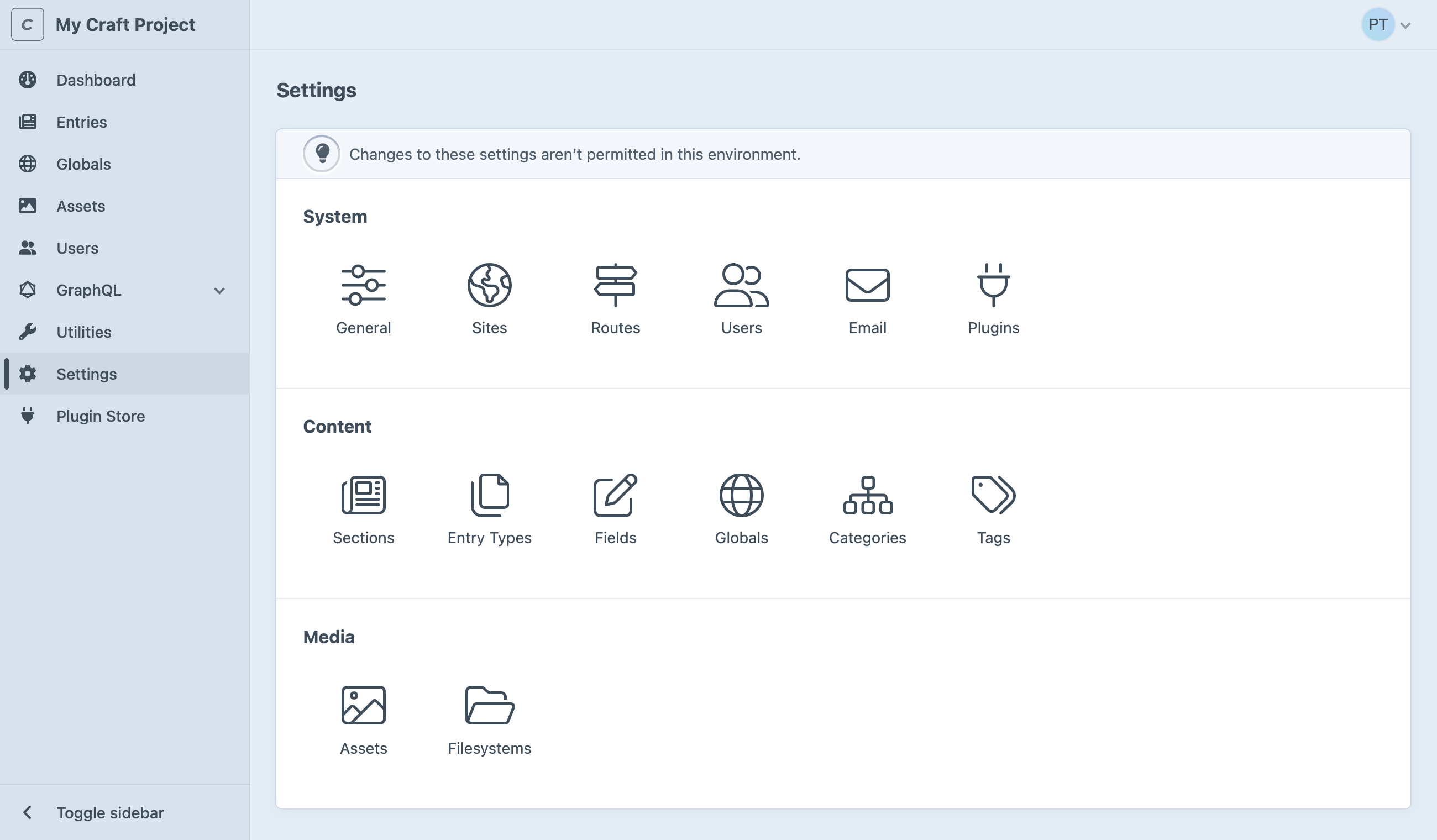
Don’t see Settings in the main navigation? Make sure you have admin privileges, and that allowAdminChanges is enabled. In Craft 5.6 and later, administrators always have access to settings in read-only mode.
We recommend that this is enabled only in development environments.
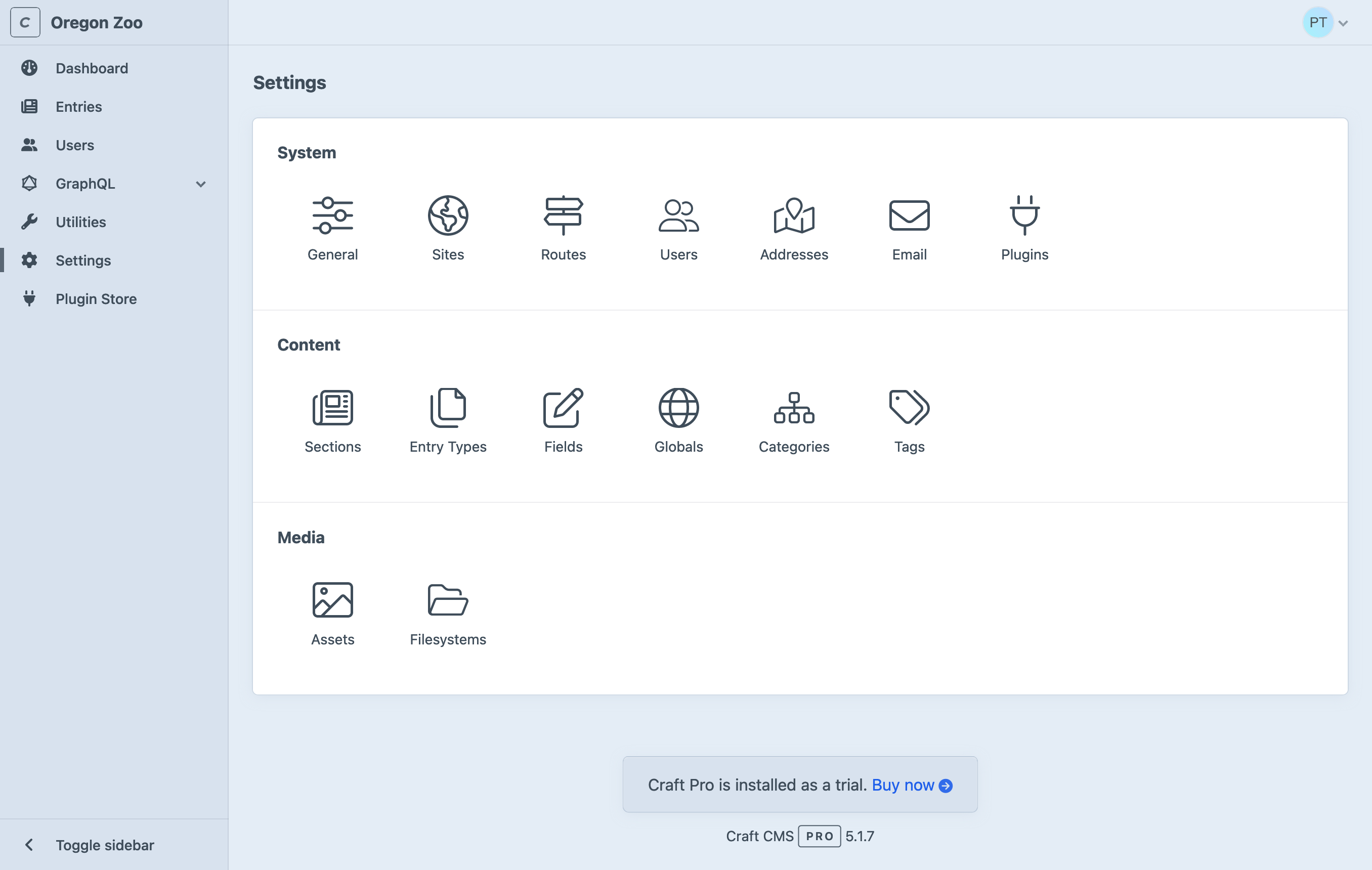
#System
System settings govern low-level Craft behaviors that often influence how other content and media features are used.
| Group | Description |
|---|---|
| General | Turn your site on or off, set a timezone, and configure the login page and site icons. |
| Sites | Define Sites and Site Groups to organize and localize your content. |
| Routes | Manage dynamic routes. |
| Users | Set registration policies, define your permissions structure with user groups, and add custom fields to users. |
| Addresses | Set up the field layout used by address elements. |
| Configure how Craft sends email. | |
| Plugins | Manage available plugins. |
#Content
Combined with sites, the Content section is where you design your schema.
| Group | Description |
|---|---|
| Sections | Manage entry sections. |
| Entry types | Manage entry types, used by sections and Matrix fields. |
| Fields | Create and organize custom fields available to your elements. |
| Globals | Configure globals. |
| Categories | Define complex taxonomies with category groups. |
| Tags | Define simple taxonomies with tag groups. |
#Media
Decide how you want to store and organize uploaded files.
| Group | Description |
|---|---|
| Assets | Create volumes for organizing assets and attach them to filesystems, and configure image transforms. |
| Filesystems | Set up local or remote storage for an asset volume. |
#Plugins
Additional tiles may appear in a fourth group, after installing plugins. Plugin settings are also accessible via the
- Settings
- Plugins
#Read-Only Mode 5.6.0+
Administrators can always view settings. A banner appears at the top of each settings screen, and inputs and controls are simplified or disabled:
#Plugin Store
The control panel provides an easy way to browse the Plugin Store and try or buy plugins with one click. Plugins can only be installed when admin changes are allowed.
#Tips + Tricks
The control panel has some cool tricks up its sleeve.
#Slideouts
Slideouts are used in a number of situations to simplify or contextualize an editing experience.
Any time you see an element chip or card attached to a relational field (or within a Matrix field), or in an index, you can double-click it to summon a slideout.
Slideouts also work for creating new elements on-the-fly from an element browser.
There is one exception, here: slideouts cannot be opened if the user doesn’t have permission to edit the element—even if they were able to select it from a relational field.
While slideouts support most element edit screen features, you may find that it’s more comfortable to open it in a new window—just click the icon in the upper-right corner, or use the action menu. Features you’d normally find in the sidebar have been tucked into a secondary panel for slideouts; this can be toggled with the button next to the pop-out link.
#Action Menus
Wherever you see a small button with three dots (
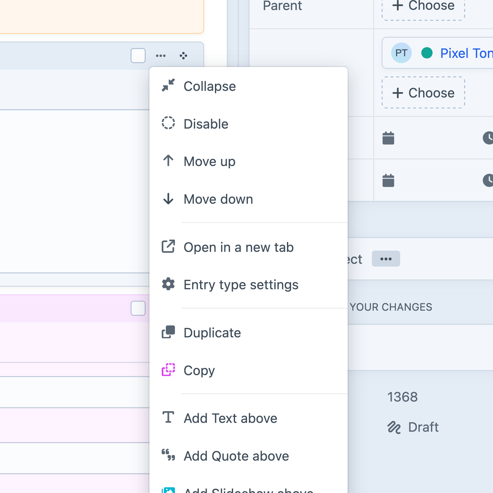
Each element type provides its own set of actions—some of which may be dependent on the current user’s permissions, or the characteristics of the individual element (like what entry type it is, which section it belongs to, or what asset filesystem it uses).
#Keyboard Shortcuts
#Saving
Any time you are on a screen (or slideout) that represents a single editable record or form, Command+S will save it and keep you on the page. In most places the save shortcut is supported, Command+Shift+S will save the current record and set you up to create another.
Always check “combo-box” menus (the fly-out arrow next to a red button) for more shortcuts!
#Group Selections
Throughout the control panel, you will find groups of checkboxes or other focusable controls in a list of items. Ticking one checkbox, then holding Shift and clicking a second one will tick all the intermediate ones, as well. Element indexes are a great place to try this out—but it will also work on nested entries within Matrix fields.
#Drag-and-Drop
The
In some situations, dragging can be combined with group selections!
#Search
Craft has a powerful search system that complements the condition builder on every element index.
#Accessibility
The control panel is designed and built with accessibility
In addition to built-in interfaces, the content tools you configure for authors are backed by components that we regularly audit (opens new window) for conformance.
#Navigating the control panel
Skip links and landmarks have been incorporated throughout the control panel to make navigation via keyboard and screen reader more straightforward.
#Skip Links
Global skip links are found at the beginning of each control panel screen.
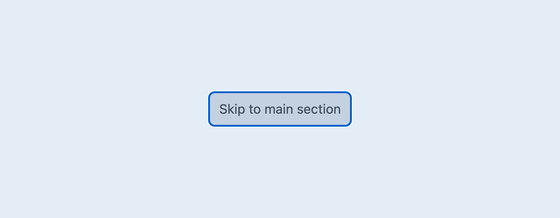
These include:
- Skip to main section: Skips to the
maincontainer. This container includes the page header, which contains the page title and controls for the current screen. - Skip to left sidebar:
5.7.0+ Skips to the sub-navigation container. For example:
- On element index pages, this moves keyboard focus to the “Sources” menu.
- On account pages, this moves keyboard focus to the “Account” navigation.
- Skip to content: 5.7.0+ Skips to the primary content pane on the page.
- Skip to right sidebar: 5.7.0+ Skips to the details container, which includes page metadata.
The accessible names for the “left” and “right” sidebars respect your user’s language setting, and will flip when using a right-to-left script.
Only links that point to a region used in the current screen are exposed in this list. In addition to global skip links, other parts of the control panel may include local skip links. For example, element index pages contain a Skip to footer link within the content region that jumps to pagination and bulk actions in the “footer” toolbar.
When saving an element, success and failure states are announced via a live region, and an error summary is added to the top of the content region:
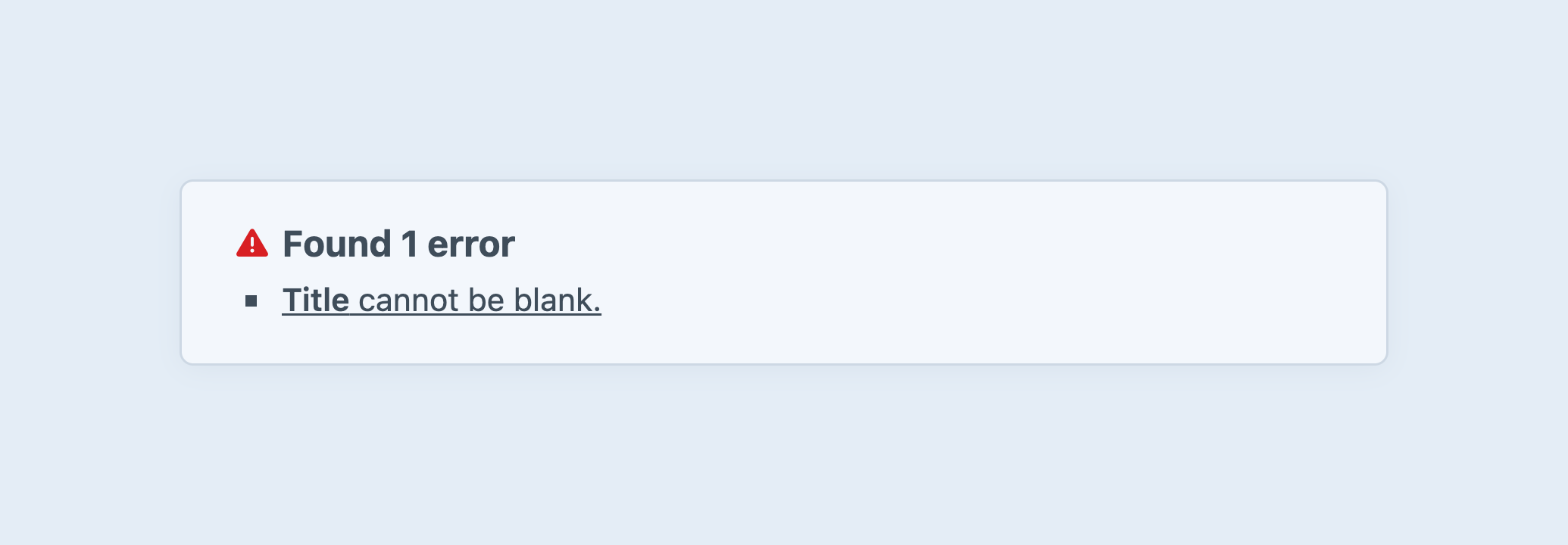
Each of the validation messages link to the field that they apply to. Jumping to an error may switch to a different tab in the field layout than is currently selected.
#Landmarks
Special regions of the control panel are designated using roles (opens new window). These include:
main— This landmark contains the bulk of the page content.nav— Depending on the page, there may be several navigation landmarks, including:- Primary navigation — Links for the primary sections of the control panel, like Dashboard, Entries, Settings, and so on. Available on most screens.
- Breadcrumb navigation — Links to each parent, owner, and relevant organizational component (like a section or static route). Available only when working with structures, nested elements, or settings.
- Secondary navigation — Located inside the
mainlandmark, the secondary navigation’s accessible name will change based on where you are in the control panel and what the links within it represent. For example, in the My Account screen, it is called Account; on the Entries or Assets element index it is called Sources.
status— A live region where flashes and other dynamic messages are injected.
See the tour section on this page for more information on each of these sections.
Some screens (like the login page, errors, and post-update prompts) have a single, generic content container, and don’t include labeled content or navigation regions.
#User Preferences
The control panel can be customized to match your needs by visiting
- My Account
- Preferences
Your preferences are not applied to the login screen or other off-session pages, but your developer can use the accessibilityDefaults setting to apply defaults.
- Display Settings
These settings are concerned with the appearance of the control panel UI.
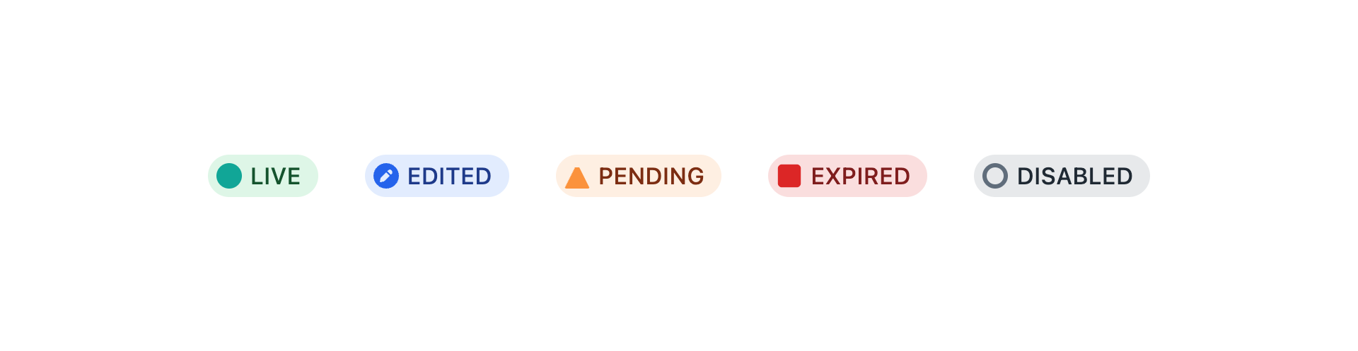
- Use shapes to represent statuses: Statuses are always represented by colorized “badges,” and—in some cases—icons. Enable this setting to use shapes for otherwise indistinguishable states.
- Underline links: This setting adds underlines to all links inside the control panel.
- General Settings
- Disable autofocus: Some inputs inside the control panel use the
autofocusattribute, so keyboard focus may move unexpectedly; these include search inputs on element index pages, and the first input on Edit screens or inside of slideouts. Enabling this setting will prevent this autofocus behavior.
- Disable autofocus: Some inputs inside the control panel use the
- Notification Settings
Both Duration and Position of notification “toasts” can be configured.
- Notification Duration: By default, toasts are shown for five seconds before disappearing. You can shorten this timer to two seconds, extend it to ten seconds, or have them remain indefinitely (allowing the user to close them manually).
- Notification Position: Toasts appear at the bottom-left corner of the screen, by default. This setting allows you to customize which corner of the screen they are placed.
- Slideout Position
Slideout position can be changed to show on the left- or right-hand side of the screen.
Notification and slideout preferences are stored in a script-agnostic way, so they will behave naturally if you switch between LTR and RTL languages.
#Image editor
The built-in image editor features a number of keyboard-accessible adjustments. 5.9.0+
From the right sidebar on an asset’s edit screen, find the Edit image button. A modal will open, with tabs for Rotate and Crop.
If you can’t find the Edit image button, the asset may not be transformable on the current system.
This may be due to the file type (i.e. PDF), or your image driver.
#Rotation
Images can be rotated 90° clockwise (Rotate Right) or counter-clockwise (Rotate Left), flipped vertically and horizontally, or “straightened” in increments of 1° using the Rotate slider.
Use the Focal Point button to add a position control to the image.
You can nudge the focal point horizontally or vertically; the value is stored as a proportional coordinate pair, with decimal values between 0 and 1.
The focal point is used to keep subjects within a transformed image—for example, vertical head-shots attached to staff profiles
Some asset filesystem types (AWS S3 (opens new window), in particular) can automatically detect subjects and populate the Focal Point attributes. Combined with transforms, this can help keep subjects in-frame, when assets are used in multiple contexts.
#Alternative Text
Craft provides a native Alternative Text field for assets. In addition to simplifying how images are output in your front-end templates, this provides a known source for image descriptions, when their thumbnails are displayed in the control panel.